Is Unemployment Improving due to policies of the President or of Republican Governors?
Ohio is the most important swing state due to the Electoral College and the current polling numbers, so it's no wonder that Obama is touting the unemployment numbers in Ohio which are lower than the national average. When President Obama took office the unemployment rate in Ohio was 8.6% and it is currently 7% (the national average is 7.8%). The Republicans have been attacking Obama for high unemployment rates (pretty much during his entire Presidency) and so this causes a problem for them. They certainly aren't going to just let Obama have this as a win, so they need a different story.
The story they've decided on is that President Obama's policies didn't do anything, but instead they want to claim the glory for Republican Governors of the states. They are trying to make the argument that the reason why unemployment numbers are dropping is because of those Republican policies and that the "blue state" policies are not working.
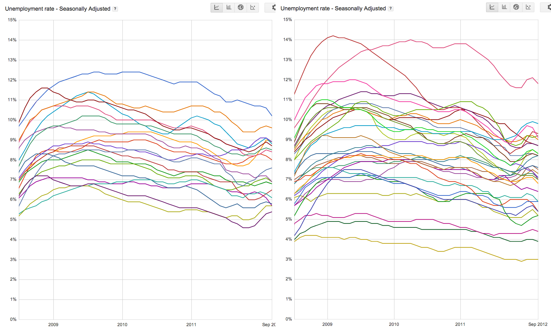
It got me thinking... are the states with Republican Governors doing better with unemployment? I built two charts to find out.
One of these charts shows the unemployment rates for all of the Republican Governor states and the other is the all of the Democratic Governor states (Rhode Island is excluded because RI has an Independent Governor, sorry!). Based on the direction that unemployment rates are changing in these charts.... can you tell which is the Republican chart and which is the Democratic chart?
(click image for larger version)
Both of these charts seem to show the same downward trend (despite a couple of high outliers on the chart on the right). The slope of the lines seem to be about the same.. it looks like the downward trend in unemployment rates is a nationwide effect. It doesn't seem to be isolated to Governors from a single party.
I took a look at the numbers for both of these charts to see if there was a real difference in the numbers that wasn't easy to see in the overall trend of the data.
I took the unemployment rates for January 2009 (when President Obama took office) and compared them with September 2012 (the most recent numbers as of the writing of this post). First, I calculated the difference for each state. For example, Ohio went from 8.6% to 7% so the difference is -1.6% (a larger negative number is better). Then I calculated the average of these differences, one average for the Democratic Governor states and one average for the Republican Governor states.
One of charts is -0.125% and the other chart is -0.252%. So, two things jumped out at me when I saw those numbers:
1) They are both negative which means, on average, the states are in better shape than they were when President Obama took office.
2) They are VERY VERY close. The numbers don't betray a big difference for either chart.
These charts do not show a partisan trend; they show a national trend.
The data shows that Democratic Governor states are improving the same amount that Republican Governor states are improving.
It is a national recovery.

